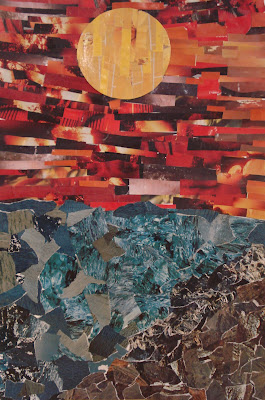
My Grade 9's recently finished their landscape collages. I wanted a landscape lesson that wasn't drawing-based and I also wanted to use up a bunch of old magazines and scraps of coloured construction paper, so this project was the perfect solution. It uses minimal materials to get quite lovely results.
Students were required to create a landscape that incorporated a background, middle ground and foreground. For the paper, they had to use a combination of ripped and cut (with scissors) paper to create contrasting shapes and a variety of textures.
For inspiration, you could show students the work of California collage artist Eileen Downes.
They started by sketching out a plan for their landscape- a simple pencil drawing- and labeling what colours would go where. (see below) They could re-create any type of landscape they wished (seascape, cityscape, landscape, etc). We used heavy-ish white paper, about 12 x 18 inches.
Then they looked through the magazines and ripped/cut/collected the necessary colours.
They started gluing, with watered down white glue and a paintbrush, from the sky (background) and worked their way down to the bottom.
I gave them manila envelopes to store all their pieces between classes.
This project was quite time-consuming and took about 5-7 classes to complete. If you want to spend less time on these, use smaller paper- like 9 x 12". For my really slow-paced students, I accomodated them by giving them smaller paper to work with; it helped alot.
Once dry, students can protect them with a coat of water-based varnish (ie: modge podge, etc).
Ta da!
 |
| This is based on Claude Monet's painting "The Cliff' at Etretat" |
 |
| The yellow brick road leading to Oz! |


13 comments:
These are fantastic! Great landscapes.
Every single one of these are just plain gorgeous! Wonderful job!
Fabulous!! They remind me of David Hockney. Did your students look at Hockney's work at all for inspiration?
Thanks all!
Phyl: no, we didn't look at any artists for inspiration, but now that you mention it, a couple of these do indeed resemble Hockney's photomontage work!
Wonderful work - wonder if I could adapt to younger kids...
Beautiful landscapes.
Interesting compositions.
Nancie- you could definitely do this with younger kids- just use smaller paper (8x10") and maybe give them coloured construction paper to use for the colours, as it took my kids a long time to find and build up a supply of the colours they needed- esp. the popular ones like blue and green.
yine harika çalışmalara imza atmışsınız siz ve öğrencileriniz.tebrikler...
Alanay- thank you! teşekkür ederim
Another amazing lesson. Where were you when I was in high school art?
Hi! I love these landscape collages and I'd like to try something similar with my students. Can I ask about the guidelines you give to students? Do you tell them the maximum magazine piece size, a certain number of colors or values that they need to have, etc? Are they working from an online image? Thank you so much!!
Hi Cristin,
Thanks for your comment. I used to use 12 x 18" paper but now I realize it just takes way too long. I now use 9 x 12". Yes, they find a landscape online and get it approved by me first- it can't be too simple, but then again, not too complex. I don't tell them how big to cut the magazine pictures; I show them samples so they have an idea that they shouldn't be too big. They need to both cut and tear the paper. They choose their own colour just based on their chosen reference photo. Hope this helps!
Thanks so much! Starting this today!
Post a Comment