ABOUT THIS BLOG

"A Faithful Attempt" is designed to showcase a variety of K-12 art lessons, the work of my art students, as well as other art-related topics. Projects shown are my take on other art teacher's lessons, lessons found in books or else designed by myself.
Thanks for visiting!
LAND ACKNOWLEDGEMENT I acknowledge, with deep respect, that I am gathered on Treaty 7 territory. I acknowledge the many First Nations, Métis and Inuit whose footsteps have marked these lands for generations. I respect the histories, languages and cultures of all the Indigenous peoples of Canada, whose presence continues to enrich our community.
Showing posts with label artist Paul Klee. Show all posts

Saturday, May 2, 2020

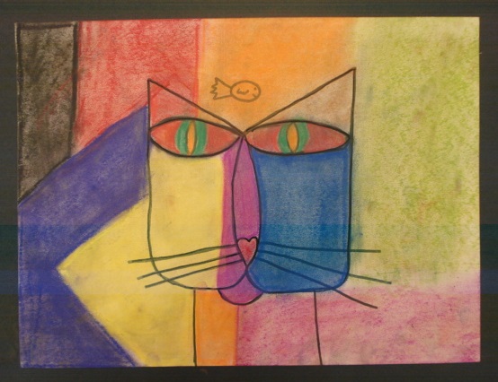
Paul Klee Cat in chalk pastel


This is a really popular art lesson with elementary Art teachers everywhere and for good reason. It combines art history with the art elements of shape and colour. Plus all kids love animal themed art projects! This one will have all the cat lovers in your class very happy.
I've posted this project previously HERE

I show Grade 2 students Klee's famous work seen below. We discuss the shapes used, how he might have drawn it, the colours and colour blending and the symbols they can see within the painting. 


             I project the painting onto my TV so the kids can refer to it while they draw/colour. 


They start off my drawing the cat head shapes and then add the bird and circle above it. 


Outline everything with a black wax crayon or oil pastel.


Then we use my least favourite art supply ------> chalk pastels!

They are excellent for blending and getting a nice diffused look so work well for this project. 
Keep wet cloths at each table so the kids can wipe their fingers off. 


Some Grade 2 results:


Wednesday, May 8, 2013

Chalk Pastel Klee Cats


Grade 3 students made these charming chalk pastels cat drawings  inspired by 
the delightful Paul Klee painting "Cat and Bird" (Katze und Vogel)

Klee was a Swiss artist who had a wide range of styles throughout his career. One of his main influences, though, was children's art. He was fascinated by their art- the simple lines as well as their innate creativity. You can see this influence in "Cat and Bird" with it's simple lines and cat head composed of simple shapes. 
I love the cat's large, unwavering, hypnotic eyes.

Students first looked at the painting and I asked them why they thought a bird might be on top of this cat's head. I got a few different answers including, "The bird is just resting on his head eating small insects", I guess like a beneficial parasite- cleaning the cat! lol  

I prompted the 'suggestion' that maybe the cat was thinking/dreaming about the bird (eerm, to eat it?) Perhaps the artist wanted to show what was happening in the cat's mind. So the kids had to think of one 'thing' their cat would be thinking of and include that in their drawing.

Paul Klee, "Cat and Bird", 1928, oil & ink on canvas     Source
 Students started off by drawing a simple line drawing of the hat's head and what it was thinking of. 
I have to reeeaally encourage this age group to draw LARGE- fill the page!!


Then outline all the pencil lines with a dark marker, crayon or colored pencil.


Once the drawing is outlined, erase any stray pencil lines that are still showing (craftsmanship!!)
Now you're left with a lovely crisp, clean drawing.


Demo or review how to use chalk pastels. I emphasized soft blending using a finger or a paper towel, using the side of the pastel, mixing colours, and using the same 4-5 colours throughout the whole drawing 
in order to create harmony and unity.

chalk pastels

Grade 3 cats- ta da!


Saturday, January 28, 2012

Paul Klee Inspired Heart Painting


Valentine's Day is fast approaching- it's one of my favourite holiday times as it involves alot of pinks, reds, glitter and sweets! So I have a couple of Valentine themed projects that I will share in the next couple of weeks.

The first project is a reposting of a Paul Klee inspired Valentine project my Grade 6 class made last year.

"Art does not reproduce the visible; rather, it makes visible." Paul Klee

Paul Klee was a Swiss-born artist who worked in a variety of styles during his career including Expressionism, Cubism and Surrealism; therefore, his work is difficult to classify into one style. 
His work has a very whimsical, musical and almost child-like style. In fact, Klee greatly admired the art of children who he felt seemed to create free of any outside influences. He tried to achieve the same untutored simplicity in his own art.

If you even get a chance to visit Switzerland, check out the Paul Klee Museum in Berne. I visited it back in 2006 and it's fantastic. I knew a little about his work before I visited, but had no idea of the wide variety of different styles he had. 
I left with a new appreciation and understanding of him afterwards.

Paull Klee, "The Rose Garden", 1921      Source


This project focuses on his Cubist period; breaking up the picture plane into angular shapes. It also introduces the wax-resist technique. 
This project took about 2- 90 minute periods to complete.


Paul Klee, "Landscape and the Yellow Church", 1920


Here's how we made these:

Fold a sheet of paper in half and cut out one or two hearts (or more).


Trace these onto a piece of cardstock (or any smooth paper).


Here, a student is practising first in her sketchbook.
Using a ruler, break up the picture plane into rectangles, squares, etc.


Here's a finished rough copy.


Pass over all the pencil lines with a Sharpie or black pencil crayon.
Then choose a few colours of wax crayons (4-5) and roughly colour in each sections,
alternating colours. Make sure to press hard.


Don't fill in all the paper- we'll be using paint for that.


Here's a close-up showing the white spots leftover- that is what you want.


Here's a student adding black pencil crayon after she finished colouring. Either way works.


Now for the wax-resist painting: we used tempera discs simply because I find them convenient and they work well. Watercolours, or liquid watercolours would also work brilliantly.


It is important to choose a colour that looks good with the wax crayon- you can choose a contrasting colour for a more dynamic effect, or a similar colour for a more calm effect.
Add a lot of water so it's more like an ink consistency.  

Then, you simply paint over the entire artwork (go in broad strokes in one direction with a flat brush) and then blot up any excess paint that's floating on top of the wax crayon parts. 
The paint will colour in all of the white spots and make the whole piece unified.


Dab excess paint off with a paper towel....


Ta da!


Grade 6 work:


Related Posts Plugin for WordPress, Blogger...