ABOUT THIS BLOG

"A Faithful Attempt" is designed to showcase a variety of K-12 art lessons, the work of my art students, as well as other art-related topics. Projects shown are my take on other art teacher's lessons, lessons found in books or else designed by myself.
Thanks for visiting!
LAND ACKNOWLEDGEMENT I acknowledge, with deep respect, that I am gathered on Treaty 7 territory. I acknowledge the many First Nations, Métis and Inuit whose footsteps have marked these lands for generations. I respect the histories, languages and cultures of all the Indigenous peoples of Canada, whose presence continues to enrich our community.

Monday, February 27, 2012

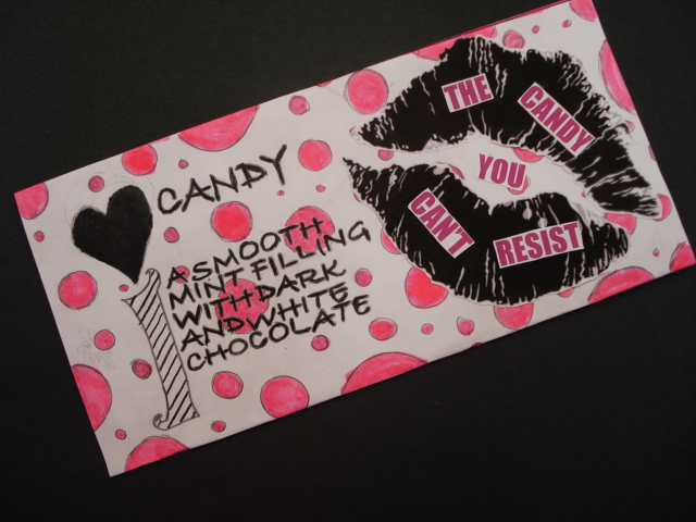
Chocolate Bar Wrapper Design


This was a total fluke lesson which turned out really well. When I was away from school at a conference one day, I left the dvd "Charlie and the Chocolate Factory" for the Grade 7 class to watch. When I came back, I had them design their own wrapper for a chocolate bar. They had to include a name, a catchy phrase to promote the bar, and list the key ingredients. I gave them a template I found online that you simply cut out, fold and glue. Students used coloured pencils, markers and collage. Some that finished early wrapped a piece of cardboard with tin foil and stuck it inside the wrapper. 
Great job everyone!


Wednesday, February 22, 2012

Ndebele African Animal Drawings


This is an oil pastel project I did with a Grade 7 class based on the art of the South Ndebele people who live in South Africa.

The Ndebele are world famous for their brightly painted houses as well as beadwork. The women of the Ndebele traditionally create the wall art of their home. The tradition and style of house painting is passed down in the families from generation to generation by the mothers.

The house were traditionally built with mud bricks and plastered with mud. Feathers or bundled-twigs were used as brushes to apply the mixture of clay and dung onto the prepared surface. The Ndebele used to paint their homes with cow dung but changed as clays of different colours were added to produce black, red, white, green and yellow.

Today, of course, they buy commercially made paints. The walls are whitewashed  and then geometric patterns and shape are drawn with the rich black outline and later filled in with vivid colour. There are five main colours typically used: red and dark red, yellow to gold, a sky blue, green, and sometimes pink. The colour white is always used as the background because it makes the bright patterns stand out more. (Source)


When I lived in Southern Africa, one of my goals had been to visit a traditional Ndebele village. I saw photos of these colorfully painted houses in my parent’s National Geographic magazines growing up and was always fascinated by them. They seemed so contemporary and unlike any other ‘typically’ African architecture. During Xmas break, I was able to visit the Mapoch Ndebele Village, which is located outside of Pretoria in South Africa. 
You can see more photos of the village here.

 It was one of the most interesting guided tours I’ve ever been on, I suppose, because it was primarily arts-based. I also got the chance to meet the famous Ndebele artist, Francina Ndimande. I asked her a few questions about her technique. While she was very reserved and succinct with her answers (to say the least!) she did tell me that she uses no references for inspiration- all the designs come from her mind. She also doesn't pre-plan any ideas. I also asked her if she used a ruler to achieve the perfectly straight lines and she said no.
The guide told us that the art of house painting may die out because the young people today are ‘lazy’ (lol) and not willing to learn the craft. There’s a really beautiful gift store there with all proceeds going to the artists. So I was able to buy a small painting by Francine and a traditional beaded doll.


So for the project, I introduced the students to Ndebele art through a slideshow of photos. I also passed out my own personal photos so they would have ideas and inspiration for their border design. Students also brought in a photo of an African animal of their choice.
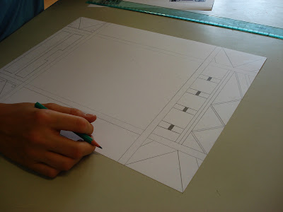
They started off by measuring and designing a thick border (at least 2 inches) filled with bold geometric shapes.


Once the border was complete, students drew the animal inside. They could choose to draw only the head (cropping) or the whole animal. Once drawn, students coloured the animal using oil pastels. I encouraged them to lay the colours on THICK and mix and blend a variety of colours for more realism. Then they coloured the border. 
For the final touch, students outlined the border shapes with a thick black outline. 
Just FYI, you will not have any black oil pastels left after this project! 
(I always try and buy extra separately)


Grade 7 results: Ta da!


Bulletin board display:


Thursday, February 16, 2012

Mutant Superhero Drawings


When I was in university studying to become an Art Teacher, I remember one of our profs telling us that it was really important to stay up-to-date with what was 'cool' with students (this was a class for secondary trained teachers) so we would be able to know what they were into or at least know what they were talking about. It would also help us plan lessons that would be relevant and interesting to them. He even went so far as to suggest we buy a 'teen magazine' once in a while to see who was hip and happening. Um, well, I just watch "Entertainment Tonight" for that that! Anyway, I feel it was good advice, but I'm sure not going to design any Justin Bieber lessons any time soon! (sorry Grade 7 girls!)

Thankfully (?) I'm a huge fan of fantasy/adventure-type films that many teens are into as well. I think with movies, though, there's no real age limit. So - nerd alert- I'm a HUGE X-Men fan- have seen and loved all the movies (don't go as far as reading the comics, though). When I taught in France, the new X-Men Origins film had just come out. The movie theatre near my house had a small 11 x 17 inch movie poster for the film on display. My friend knew the owner of the theatre and kindly phoned him and, well, used the 'I'm a teacher' card (works every time) and asked if I could have the poster for 'my classroom' (aka- house). 
The owner said sure, just come by and pick it up at the front desk in a week. 
So I was really happy to say the least. 

Well, what was waiting for me turned out to be this ginormous sized poster (well, in French it's referred to as "grande affice"). It's the size they use for posters in the train stations and bus kiosks: 4 x 6 foot. French love for all things art is an understatement, hence no surprise that this movie poster size is the largest in the world. So now I have this tres grande poster that I can't frame because it would be too expensive, 
so it's just been sitting in my closest. Shame. 

my grande poster on my grande couch for size comparisons

ANYWAY, back to the art lesson... This was a project a Grade 9 class worked on during the last week of school last year. You know the last week is always full of kids either catching up on work, or slacking off or super hyper. I decided to show a movie (yes, I'm one of those teachers! lol) during the second last class and brought in my X-Men dvd. During the movie, a couple of the students said, "Hey, we should design our own mutant." I thought that was a brilliant idea, and together we planned out the lesson.
Because we only had one 90 minute class to work on this, not many managed to finish it unfortunately.
But it was easy enough for them to take home and finish.

The objective was to design a mutant superhero: they had to think of and write down their mutant's powers, their costume, their 'real name' and 'mutant name', personality and maybe a bit of their back-story (where they are from, how their powers manifested, etc). For example, Wolverine has animal like senses, healing powers, retracting claws and enhanced physical capabilities. He is brutish, tough, a capable leader, skilled in all martial arts, very knowledgeable (fluent in over 8 languages) and he's Canadian- from British Columbia just like me! He is basically awesome ;)

ANYWAY.... students started off by looking through a bunch of manga-type drawing books I have in the bookshelf. Kids use these when they finish a project early and can practice drawing in their sketchbook. There's lots of figure drawing instructions which the kids find helpful. I have to admit that teaching figure drawing is not my strong point. An area I need to work on for sure.


Draw out the basic body structure....


Add form to it....


And then erase your guidelines and finish it off nicely.


Students could use any media they wanted for the final copy: coloured pencils, markers, pen, etc.
I can't wait to try this project again when there's actually more time.

"Aqua Girl" - controls water

"Gravity" aka- Allyson McKay. She uses the force of gravity to disable her attackers.


I love how this student used the pen and ink cross-hatching technique that the class learned earlier 
with the "Southwestern Desert Landscapes" project.

Thursday, February 9, 2012

Van Gogh Style Portrait


This is a Middle School portrait project which was inspired by the style of Post Impressionist Dutch painter Vincent Van Gogh. He is, by far, one of my most favourite artists to introduce to students because of his fabulous work and his dramatic, tragic and yet somehow inspiring life story.

The goal was to have students experiment with mixing different colour combinations of oil pastels and to create lines, patterns and textures using oil pastels. I started off by showing students a slideshow of the many portraits created by Van Gogh. Try to zoom in on the portraits to show the multitude of colours he actually used, the thick paint application and the way way he separately applied the colours in long and/or swirling brush-strokes. 

TIP: using Google Art Project, you can visit the Van Gogh Museum online, which has high quality images of his work that you can super zoom into- and I mean SUPER zoom!! If you have a digital projector, or a SMART board, you're good to go.

Self-Portrait with Bandaged Ear, 1889   Image Source

Self-Portrait, 1889  Image Source

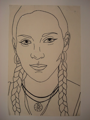
So, before students create their Van Gogh style portrait, they have already completed a realistic face drawing and learned all about proportions and all that. Each student needs to have completed a simple line drawing- no shading needed. Students had a choice from working from a photo that they brought in or drawing each other. I take this drawing and photocopy it for the colour version, as I've found that after all the hard work of drawing a realistic portrait, students are mortified when I tell them we're going to colour over it all; in oil pastels no less. So I make a copy to appease their worries about 'messing it all up'.
I love using oil pastels and feel there are endless opportunities with them. Students, however, in my experience, tend to struggle with them (the smear factor mainly) and many actually hate them. It takes them a while to learn how to use them properly, to really build up thick layers and mix and blend them.


So they first need to practice mixing colours and creating lines/patterns with the oil pastels in their sketchbooks. Once they have a good feel for it, they start on their good copy. I tell them to start with the light colours first, then slowly build up the layers, adding more and more oil pastels until there's not much of the background paper left showing. It takes quite a while to get to the finished stage. They can finish up by adding final details with black. 

I found with Grade 8's I taught this too, well, many of them ran out of patience, 
but Grades 9 and up had no problem.

All in all, I find with this project students can get frustrated with the oil pastels: "it keep smearing!" and "it looks weird" but as they start to really layer and build up the oil pastels, they start to see it working.
 (And then I get to gleefully say, "See, I told you so!" heh, heh)


You can see the colours pale pink, white, yellow and orange used in the skin,


The two artwork below were drawn by two boys who were best friends in a Grade 8 class. They drew each other from life and they actually achieved a very good likeness of each other. But I think it's so funny how they look related and have such pursed, serious mouths!!


Grade 9 example:


Here's another Grade 9 example- first the pencil drawing:


Then with the oil pastels:


Related Posts Plugin for WordPress, Blogger...