ABOUT THIS BLOG

"A Faithful Attempt" is designed to showcase a variety of K-12 art lessons, the work of my art students, as well as other art-related topics. Projects shown are my take on other art teacher's lessons, lessons found in books or else designed by myself.
Thanks for visiting!
LAND ACKNOWLEDGEMENT I acknowledge, with deep respect, that I am gathered on Treaty 7 territory. I acknowledge the many First Nations, Métis and Inuit whose footsteps have marked these lands for generations. I respect the histories, languages and cultures of all the Indigenous peoples of Canada, whose presence continues to enrich our community.

Tuesday, April 28, 2015

Found Poetry: "The Book Thief"


This was a collaborative project I did in conjunction with the wonderful English teacher at my school. Her junior high class (mostly Grade 8's) finished reading "The Book Thief", a novel by Australian author Markus Zusak.


Brief synopisis: 

The Book Thief is a novel that centers around the life of Liesel Meminger, a nine-year-old girl living in Germany during World War II. Liesel's experiences are narrated by Death, who details both the beauty and destruction that life in this era brought. 
It is 1939. Nazi Germany. Liesel is a foster girl living outside of Munich, who scratches out a meager existence for herself by stealing when she encounters something she can’t resist–books. With the help of her accordion-playing foster father, she learns to read and shares her stolen books with her neighbors during bombing raids as well as with the Jewish man hidden in her basement. 

There's also a wonderful movie based on the book which I highly recommend!!


Found poems essentially take existing texts and refashion them, reorder them, and present them as poems. They are the literary equivalent of a collage. One can take words, phrases, and sometimes whole passages from other sources and reframe them as poetry by making changes in spacing and lines, or by adding or deleting text, thus imparting new meaning.

To start off, students were each given a photocopied page from the novel. They could do whatever they wished to this page in order to alter it. We showed them some examples of found poetry online, and how artists highlight and choose certain words and phrases that resound with them. The kids could use whatever medium they preferred. There was quite a variety including watercolour, pencil drawing, coloured pencils, collage, and markers. The students worked completely independently on this project and were given pretty much free reign and we were really pleased with the results.






Tuesday, April 21, 2015

Illuminated Initials


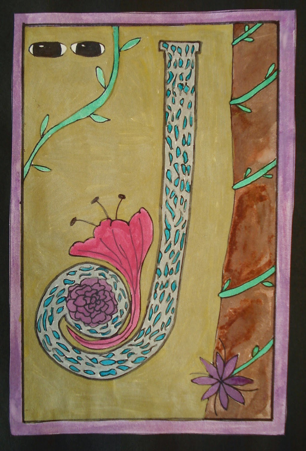
My Grade 6 students are in the middle of a Medieval Art unit. They recently finished up their illuminated initials. I started off by showing a slideshow on illuminated manuscripts, gave some brief history, etc. We watched a great video on how illuminated manuscripts were made from the Getty Museum. 

Students started of by drawing a border using a ruler. Then they chose whichever letter they liked; I asked them to choose a letter representing someone special to them. Then they 'illuminated' the letter. They could choose to go the traditional route or create more contemporary designs.


This book from Dover publications came in handy to help inspire students who needed extra visuals.


Once the drawing was complete, they outlined everything using an ultra fine Sharpie. Then they used small brushes and watercolours to paint their illuminations. Once dry, they used some gold markers to add some metallic accents (to mimic traditional gold leaf).


Sunday, April 12, 2015

Picasso "Blue Period" Sad Portraits


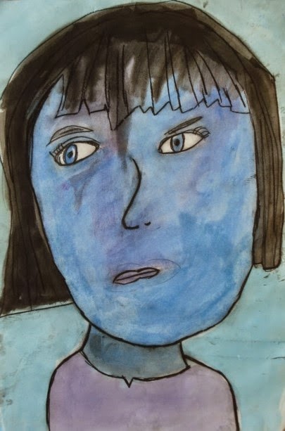
My Grade 2 students recently studied portraiture. In addition to face symmetry and proportion, we've been looking at how colour can affect a mood of a painting.
I fist had students practice drawing a face in correct proportion. One of my main goals was to have all students try to include all the small details that younger artists tend to forget: upper eyelid, eyebrows, ears in the correct position and most importantly, eyes in the correct position. I showed them on the whiteboard, what I call "forehead eyes"- whereby beginning artists tend to put their eyes waaay to high up on the face- in the forehead region.

The next class, we had a look at the some works from Pablo Picasso's "Blue Period". These were works done by Picasso between 1901 and 1904 where he painted in essentially monochromatic tones of blues. He was going through difficult times in his personal life and his art became an outlet for his emotional state at the time. 
So we discussed how colour affects the mood (blue is a cool colour) and how Picasso expressed sadness on his portrait's faces (neutral expression, sad eyebrows, body language). We discussed some times in our lives when we might be sad (death of a pet, etc). I really tried to exphasize that all art doesn't need to be happy, pretty pictures of landscapes or flowers or whatever- that it can express a full range of emotions and that all our emotions are important and valid.

Femme aux Bras Croisés (Woman with Folded Arms), 1902

So for our good copy, students drew a sad looking face on 12 x 18" heavy white paper. 
They only needed to include from the shoulders up.


Then we painted them using watercolours. I demonstrated how to mix blue with black to get more sombre tones. Students were encouraged to stick with only shades of blues, greys and blacks plus a bit of purple if they wanted. 


The next class, once the painting was dry, students went over all their pencil lines with a charcoal pencil and smudged the line to add a soft textural effect.


Overall I was quite happy with how these turned out. I had to remind a few students to include eyebrows, etc, but overall most included all the features. I'd also say most of these appear sad or worried, though a couple crossed the line into anger!! lol


Related Posts Plugin for WordPress, Blogger...