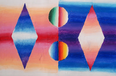
This is a project intended to teach students how to create gradations or value changes (light to dark) using oil pastels. It's also a lesson in applying and blending oil pastels. Grade 8 students were asked to draw as simple shape or object and then colour it with a range of vlues going from light to dark. The background needed to be treated in a similar manner. I encouraged them to apply the oil pastels quite thick and to layer colours on top of one another. We used a faily smooth type of white paper but I still wasn't thrilled with it- anyone have any tips for the best kind of paper to use with oil pastels? I think next time I'll use the smoothest type of cardstock I can find.
We used Pentel oil pastels becasue they were already at my school, but at a previous school I used Portfolio brand ones: http://www.dickblick.com/products/portfolio-series-watersoluble-oil-pastels/ and they were much better- very smooth and creamy and easy to blend.
Here are my Grade 8 results: Ta da!


2 comments:
Very nicely done! I too prefer the Portfolio brand - it's the only one we (district art teachers) want the district warehouse to stock for us! I prefer to use colored construction paper as a base for work with oil pastels. Each class gets a different color (I have 7 groups of 3rd graders for ex.) and the rule is that none of the paper color can show through the final artwork. This results in thick, rich color blends. Hope this helps...
Thanks for the tips, Nancie!
Post a Comment