ABOUT THIS BLOG

"A Faithful Attempt" is designed to showcase a variety of K-12 art lessons, the work of my art students, as well as other art-related topics. Projects shown are my take on other art teacher's lessons, lessons found in books or else designed by myself.
Thanks for visiting!
LAND ACKNOWLEDGEMENT I acknowledge, with deep respect, that I am gathered on Treaty 7 territory. I acknowledge the many First Nations, Métis and Inuit whose footsteps have marked these lands for generations. I respect the histories, languages and cultures of all the Indigenous peoples of Canada, whose presence continues to enrich our community.

Sunday, June 19, 2011

Cherry Blossom Paintings


My Grade 7 class recently finished these cherry blossom paintings as part of our "Japanese Art" unit.  I absolutely adore cherry blossom paintings- I think they're very stylish and feminine. I also love anything Japanese related, so I really enjoy teaching this unit. And believe it or not, the blossoms are just finishing up here where I live. Yes, in June.

We started off by watching a video about the Cherry Blossom festival in Japan known as Hanami ('flower viewing').  In the spring, thousands of people fill the parks to hold feasts under the flowering trees, and sometimes these parties go on until late at night. I thought it was interesting to find out that most public schools have cherry blossom trees outside of them.

Cherry blossoms have been used extensively in Japanese art for hundreds of years. According to the Buddhist tradition, the brief beauty of the blossoms symbolizes the transient nature of life as the flowers last for at most a few weeks. The cherry blossom is also tied with the samurai culture, representing the fleeting nature of the samurai’s life and symbolic of drops of blood.

So for this lesson students created a scroll-like painting of a cherry blossom branch using the classic 'blow paint through a straw' technique. You can find this technique all over the internet and Art teachers have been using this technique for eons. We first created a blue sky background (on long strips of white paper) with a faint full moon silhouette by placing a small circle container (in this case yoghurt) and painting around it with light blue tempera paint.


While the sky paper is drying, student practiced painting (tempera paint) cherry blossoms
in their sketchbooks. 
I demonstrated how to mix various tints of pink (always add the darker colour, red, a bit at a time, to the white- not the other way around). The blossoms: as long as they had five petals, students could paint them however they wanted and in whatever tint of pink. (You could also do plum blossoms in tints of purple).


Once the sky paper is dry, student blew watery brown tempera paint (ink-like consistency) across their paper in a branch-like shape.  I really demonstrated how to do this, as kids have a tendency to blow down as opposed to across.  If you blow downwards, you get really, erm, hairy-looking trees!!  I stress to keep it simple and follow a line of paint across the paper. Keep adding more paint and creating new branches as necessary. 
Encourage the kids to take lots of breaks as you can get really light-headed doing this!


Let these dry flat.


Next class, students paint on their cherry blossoms using tempera. 
Just add them randomly anywhere- add lots.


I own some Asian-style rubber stamp 'chops' or seals- which is basically the artists signature.
They are stamps or seals used in lieu of an artists signature in Asian art.
They are typically made of stone and used with red ink.  I have no clue what mine say and none of my Chinese students could read them either. Soooo, I just hope it's nothing rude or way wierd!
Of course, if you have lino-cutting tools, students could make their own from an eraser.


As I didn't have a red ink pad, I just squirted some red tempera onto a pad of paper towels. 
 It worked pretty good.  But an ink pad would be easier, obviously. Once these were dry, I mounted them onto larger mauve construction paper.


Here are some of the Grade 7 results: Ta da!


I displayed them with our Kimono project.


Thursday, June 16, 2011

Popcorn Interpretive Drawing


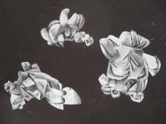
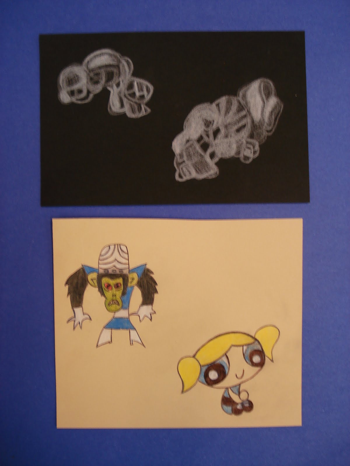
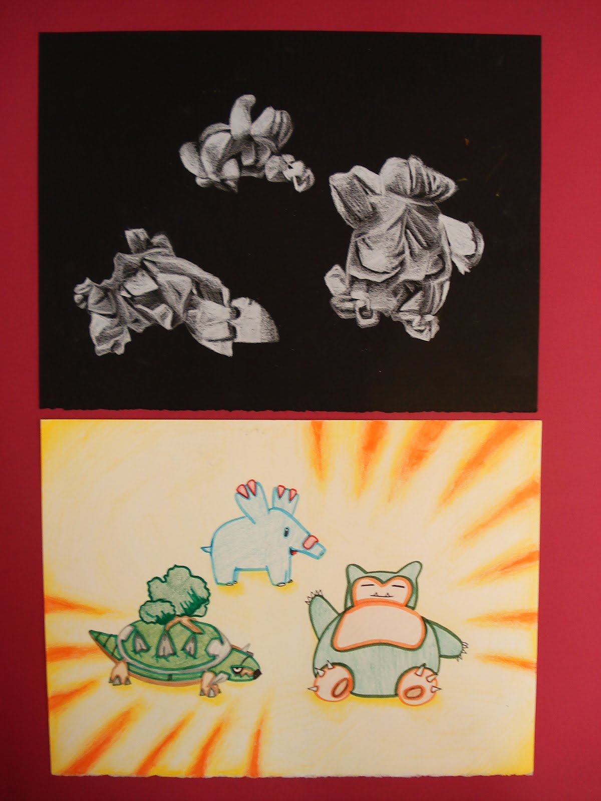
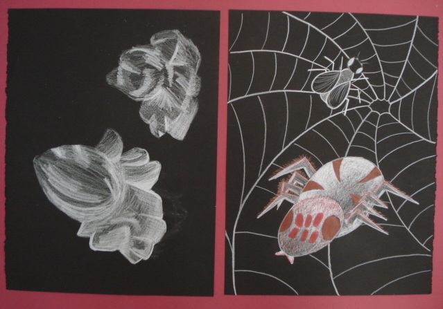
This is a drawing lesson I found in the book: From Ordinary To Extraordinary: Art & Design Problem Solving by Ken Vieth. I like this assignment because it addresses both accurate drawing from observation as well as creative thinking. I did this project as a final lesson with my Grade 10/11 class.  It was challenging for them, but I think they learned alot about drawing with this technique. It involves creating two drawings from looking at pieces of popcorn: one a realistic drawing from observation and the second involves transforming the popcorn into something else.

It also involves drawing opposite to what we are accustomed to- drawing with white on black paper.
This website explains it well:
Drawing with white material on black paper does require some getting used to.  This is because most of us are accustomed to drawing with dark material on white or lightly colored paper.  This thinking has engrained in us the need to add dark values and leave the lighter values.  When we reverse this thinking by drawing with white material on black paper, our process is the opposite.  Now, we must train our minds to deal with the lighter values and leave the darker values to the tone of the surface.  This reversal can be challenging, but important in our development as artists.  It forces us to recognize the importance of tints (lighter values) and their inherent relationships with shades (darker values).  With practice, our understanding of value and how it is used to create drawings improves.

Drawing with white media on black paper can create stunning imagery and the drawing process itself can lead to improvement in your drawing ability.  

So here's how we created our popcorn designs. I brought in a bag of popcorn I had popped at home.


Students choose 2-3 pieces and glue them to a small square of black paper. 
Carefully observe and look at the popcorn from all angles before deciding how you want to draw them.


Because students are drawing in reverse, tell them to really examine where the
lightest or whitest areas are first.


My Grade 10 students did some practice sketches first to get used to drawing this way. 
They could use either white conté or a white colored pencil.
(most students went with the 'easier to control' white pencil)
I'm not going to lie to you- many students struggled (aka: complained) with this part. 
Some just 'got' it and it took others a while.
I encouraged them to simply practice and take their time until they felt comfortable. 
I find some high school students want instant results and want to be able to draw
something perfectly the first time they try it, and tend to give up easily.


Anyway, once they are comfortable, they can do their good copy and voila, the
drawings look really cool and dramatic on the black paper.


Once they have their observational drawing complete, they need to look at the popcorn and try to see some shapes/objects, etc. in them.  Similar to when you see things when looking at clouds. 
Students were encouraged to include a setting. They used colored pencils for this step.

Here are some of the results. Ta da!


Sunday, June 12, 2011

Ceramic Folk Art Bird


This is a clay lesson I taught to Grade 1 and 2 students.  It uses the slab method, so it's helpful to have rolling pins for this project.  
I finally remember where I saw the idea: from Artsonia- Cottage Lake Elementary School.

To begin with, I usually have to help the kids roll out their clay, as it's pretty tough for their little arms.  I encourage them to stand up while they roll the clay in order to use their whole upper body strength.  Double check the thickness of them as the kids have a tendency to roll them either too thick or too thin.  I tell them to aim for a pancake-type thickness...(I use alot of food references in my art!)

I had pre-printed some simple bird shape templates, as I wanted these nice and large. The kids traced these shapes onto the clay with a pencil and cut them out with a plastic knife.  Then they 'scratch and attached' a wing shape and a ball of clay for an eye. At this stage, the kids used various tools (straws, bamboo sticks, coffee stir sticks, etc.) to add patterns and texture to their clay. 
When rolling out their clay they can also roll textured fabric into it. 
When the kids are finished, I poke a hole at the top of each one with a straw so they can be hung up.

Let dry flat for about a week; because it's a slab, I loosely cover these with plastic to let them dry slowly in order to avoid warping and cracking. 
Bisque fire, then have the kids glaze these (I use Mayco Stroke & Coat- it's foolproof) and then glaze fire.


After glazing.
 
You can also paint these if you don't have time for glaze. 
Spray with a gloss varnish for protection if using tempera like here.

This was my sample- I love birds in art.


Here I rolled my wing onto some lace fabric.

For this texture I used a wooden coffee stir stick.  It's also great for scales when making dragons or fish.


The Potters of San Marcos: The Clay and the Pot

This amazing pottery video shows a master potter from San Marcos Tlapatzola in Oaxaca, Mexico. Part I follows the process from digging clay to throwing a pot- without a wheel!!


Wednesday, June 8, 2011

Clay Bird in a Nest


This is a cute Spring clay lesson I've taught to younger students, aged 6 and 7 (Grade 1,2). 
I found the idea for creating the bird's nest at the Almost Unschoolers blog.
We started by making very simple, low pinch pots. Then, using a grater, the kids grated blocks of clay until they had a little pile of twig/grass-like material. You could also use a garlic press, but we didn't have one and the grater seemed to work well enough. The kids love this step! 


They patted this all around the outside of the pinch pot. Then they make a bird out of two balls of clay.  
I demonstrate how to 'scratch and attach' the head, wings, and beak using a toothbrush and water.  
Make some little oval eggs and stick them in the nest. 

Here's my sample after being bisque fired.
I lost the eggs somewhere along the way and had to make new ones...


Here's student work waiting to be glazed.
You can see some students had little birds hatching out of the eggs- so cute!


Mine after glazing- I like to use Mayco Stroke & Coat. The one below I actually over-fired (fired it at cone 6 instead of cone 06- whoops!) but it still survived, thank god, though the colours are much duller.

Friday, June 3, 2011

Southwestern Pen & Ink Landscape Drawing


This is a pen & ink lesson I recently finished up with my Grade 9's. The kids really enjoyed it and it was the perfect lesson for the end of the year.
It uses simple materials: white paper and black pens (ball point, rollerball pens, whatever you have). It also reinforces basic landscape drawing skills as well as hatching techniques. I found the initial idea from this website which has drawing assignments for art teachers.

So I gave students a handout which had ideas for their Southwestern style landscape- cactuses, pinnacles, buttes, mesas, desert plants, etc. They did a practice sketch first in their sketchbook (see below). You could of course also show the kids a slideshow of desert landscape photos from Arizona, New Mexico, etc.


For the good copy, simply start off with a Southwestern-style horizon line.


Then begin adding detail: students had to include a background, middle ground and foreground.
They did their good copy in pencil first, but you could also easily draw it straight away in pen.


In their sketchbooks they also practised hatching and cross-hatching techniques using a black pen.
You can find some good printable handouts from this website: http://www.artyfactory.com/

Image via: http://www.artyfactory.com/
Here's a detail of some pen hatching.  I explained to them that it's a way to show value through line.


Here are some of the Grade 9 results. I love all the different styles of hatching.
Ta daaa!


Related Posts Plugin for WordPress, Blogger...