ABOUT THIS BLOG

"A Faithful Attempt" is designed to showcase a variety of K-12 art lessons, the work of my art students, as well as other art-related topics. Projects shown are my take on other art teacher's lessons, lessons found in books or else designed by myself.
Thanks for visiting!
LAND ACKNOWLEDGEMENT I acknowledge, with deep respect, that I am gathered on Treaty 7 territory. I acknowledge the many First Nations, Métis and Inuit whose footsteps have marked these lands for generations. I recognize the land as an act of reconciliation and gratitude to those whose territory we reside on or are visiting.

Wednesday, March 30, 2011

Milagros Bas Relief


This is a bas relief (or low relief) project that uses recycled cereal boxes. A bas relief is a low sculpture technique in which the design elements are just barely more prominent than the (overall flat) background.

For this project, Grade 9 students build up the relief with layers of cut-out cereal box shapes. They had to represent something they are thankful for. 
I found the lesson plan on the fantsastic CRIZMAC website.

I first showed a slideshow of milagros examples and explained the history and meaning behind them.

from Wikipedia:

Milagros  are religious folk charms that are traditionally used for healing purposes and as votive offerings in Mexico, the southern United States, other areas of Latin America, as well as parts of the Iberian peninsula. They are frequently attached to altars, shrines, and sacred objects found in places of worship, and they are often purchased in churches, cathedrals or from street vendors.

Milagros come in a variety of shapes and dimensions and are fabricated from many different materials, depending on local customs. For example, they might be nearly flat or fully three dimensional; and they can be constructed from gold, silver, tin, lead, wood, bone, or wax. In Spanish, the word milagro literally means miracle or surprise.


This is what you'll need:
  • Sketchbooks or scrap paper 
  • Scissors
  • Pencils
  • Lightweight cardboard (we used cereal boxes)
  • Cardboard squares to use as the base for the milagro (we used mat board scraps which were donated from a framing shop)
  • White glue, paintbrushes
  • Black tissue paper (can usually find at the Dollar store)
  • Metallic crayons

I do this project towards the end of a term when I've had enough time to build up my cereal box collection- of course, you can always ask students to bring them in as well.
Metallic wax crayons or oil pastels.  Take the labels off.

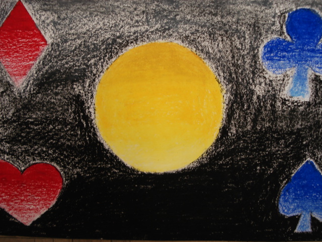
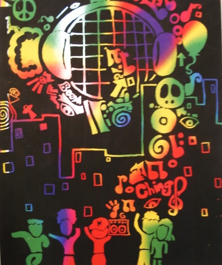
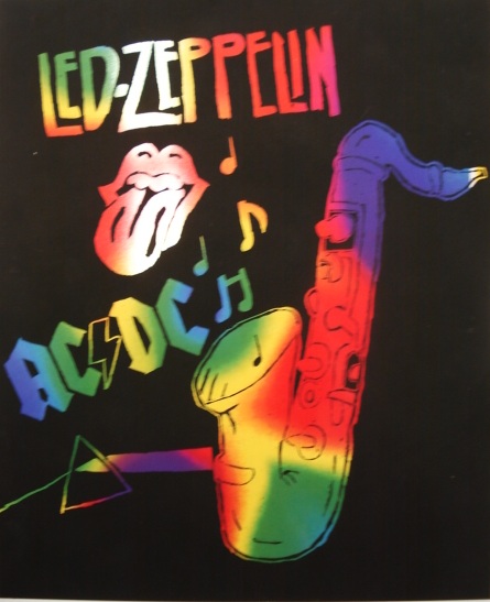
So students begin by sketching a simple design for their milagro in their sketchbook.  They needed to represent somehting they were thankful for. They had to have a minimum of three layers and they could include a word (in any language) if they wished.  I got the usual suspects of video games, but for the most part, I did get some more meaningful symbols such as love, friendship, mothers, music, etc.

Then students use a piece of mat board for the base and then start drawing and cutting out the shapes needed from the cereal boxes. Think in terms of layers. Lay it all out and decide how you want the composition to look.

When you're happy with it, glue all the pieces down with an even, thin layer of white glue.

Let dry (overnight) and you will have something like this:

Then mix up some white glue with a bit of water to thin it down, and using a paint brush, brush over the relief and then gently and carefully lay a sheet of black tissue paper (cut slightly larger than the relief) over the relief and pat it down with your fingers and/or a paintbrush.  Rub around all the shapes.  It's ok if you get lots of wrinkles.

Wrap it around the back like a present (see below) and glue it into place. Let dry.

I stacked books on top of them overnight as they had a tendency to warp a bit....

When they are dry, rub the side of a metallic wax crayon all over the design
and it will pop out and look like old metal.

Here are some Grade 9 results:
Ta da!


detail of the bas relief


"Love" in German


"Rain"

Saturday, March 26, 2011

Sign Language Hands


This is an observational drawing project focusing on hands and the sign language alphabet. Students first practiced by drawing a simple contour line drawing of their hand in their sketchbooks. Then they drew another one, this time with shading. I find that drawing from observation is the fasted way to improve one's drawing. It may not be 'easy', and many students complain at first (at least mine did! lol) but once they get into it and start seeing the results, they start having a bit more confidence and faith in the process.

I had them do a value scale beforehand and really tried to emphasize to the students to use the full range of values. Alot didn't or found it hard to do-- it seems like it's very hard for them to include black, even though we use drawing pencils and I really emphasized it to them...
 Students had to do a minimum of three hands.
For the background, they could do whatever they wanted in the media of choice.

Practicing in sketchbook...


Drawing the good copy...


Creating a background- I found that many of the backgrounds 'overpowered' the pencil drawings themselves...so the next time I teach this I will tell students to choose a more soft and subtle background.


Here are some of the Grade 9 results:


Friday, March 18, 2011

Oil Pastel Gradations


This is a project intended to teach students how to create gradations or value changes (light to dark) using oil pastels.  It's also a lesson in applying and blending oil pastels.  Grade 8 students were asked to draw as simple shape or object and then colour it with a range of vlues going from light to dark.  The background needed to be treated in a similar manner.  I encouraged them to apply the oil pastels quite thick and to layer colours on top of one another.  We used a faily smooth type of white paper but I still wasn't thrilled with it- anyone have any tips for the best kind of paper to use with oil pastels? I think next time I'll use the smoothest type of cardstock I can find. 

We used Pentel oil pastels becasue they were already at my school, but at a previous school I used Portfolio brand ones: http://www.dickblick.com/products/portfolio-series-watersoluble-oil-pastels/ and they were much better- very smooth and creamy and easy to blend.


Here are my Grade 8 results: Ta da!


Tuesday, March 15, 2011

Rainbow Scratch Art


This is another fun project my student teacher taught to my Grade 6 and 7 classes last week.  Classic scratch art. She ordered the paper (well, it's like colored acetate) here: http://store.schoolspecialtyonline.net/OA_HTML/xxssi_ibeProductDetail.jsp?itemId=476271&itemNumber=9223365028

She gave the students a theme of 'music' and then demonstrated how to create the scratch art.
Here are the tools: wooden sticks, mini squares of scratch art paper for the students to practice on and white paper to draw their designs onto.
Students draw out their designs on white paper cut to the same size as the scratch art paper. Then they paper clip it to the scratch art and pass over all the lines which will lightly transfer the design onto the black scratch art.
Then scratch away with the wooden tool.
Ta da!


Related Posts Plugin for WordPress, Blogger...