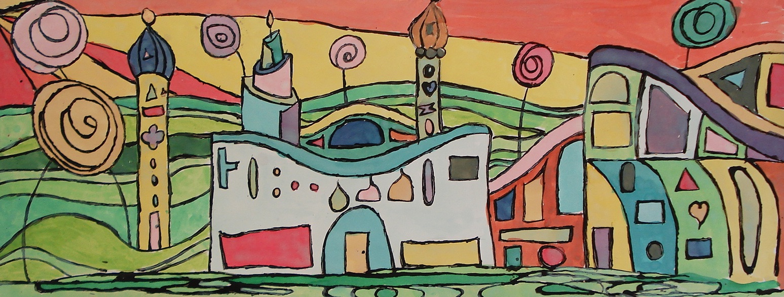
Friedensreich Hundertwasser (1928 – 2000) was an Austrian architect and painter. I first became aware of his work when I was travelling through Austria and saw his architecture in Vienna- it was so original and unlike anything I have ever seen, though it did remind me a bit of Gaudi's work in terms of outright originality. The vibrancy of his colour, the lack of straight lines and recurring motifs make him a good choice for students of any age to study.
The common themes in his work include bright colours, organic forms, love of nature, individualism, spirals, onion domes, 'lollipop' style trees, windows of different shapes and sizes and rejecting straight lines. He called straight lines "the devil's tools" and considered them 'ungodly'. He also disliked the monotany of the colour grey saying "Colourfulness, variety and diversity are by all means better than the grey, the average grey."
Although Hundertwasser first became well-known for his boldly-coloured paintings, he is more widely known for his individual architectural designs. Ecology and fantasy were very important in his works and he created his buildings in a way that nature and human beings could live together, including having live trees in and on the rooftops of his buildings.
 |
"Waldspirale" in Darmstadt, Germany, which nicely illustrates his love of the spiral and colour and
different shaped windows. |
 |
| An example of one of his paintings with his typical 'lollipop trees'. |
I was inspired by the art lesson found on
this New Zealand art education website.
(Hundertwasser is very popular in New Zealand as he made it his second home for 25 years.)
I first showed my Grade 7 students a slideshow of his work and posted pictures from my calendar on the whiteboard for them to refer to. We discussed the characteristics of his work and had a really good discussion about the differences of his unique, individualistic buildings as opposed to the houses they generally live in (in the suburbs, for the most part), where building codes are strictly monitored as well as our 'safe', standard buildings found in the city core downtown.
Then students sketched out ideas for their own Hundertwasser-style houses in their sketchbooks. They had to include a number of Hundertwasser's typical architectural elements but were also encouraged to add their own ideas and make the houses fantasy-like.
They drew their good copies on long, thin, horizontal sheets of heavy white paper.
EDIT: a few people have asked about the specific paper size. I cut up sheets of poster paper
(22 x 28 inches) into strips- I got 4 strips per sheet, so they're about 7" x 22" each.
Watercolour paper would yield even better results, if you can afford it.
I mixed up a bottle of 'black glue' (glue mixed with black India ink or black acrylic paint) and distributed it into small containers. I found these great plastic mini containers at the dollar store that come with lids, so the glue stayed in these from week to week without drying out. If the black glue thickens up, just add a bit of water and mix.
EDIT: some people have found that black ink mixed with white glue doesn't work. It might depend on the ink brand. Try mixing black acrylic paint with some white glue, or simply just slightly watering down some acrylic paint. Basically, you're looking for a black waterproof material, so when you paint later with the watercolours, the black lines to 'bleed'. As always, it's best to test your materials ahead of time before you teach the lesson.
For a shortcut, simply use Sharpies. You just won't get the organic line quality.
Students used bamboo sticks (skewers) (I buy the big bags from the Dollar Store)
to draw the black glue over all their pencil lines.
I'm not going to lie - this took a while (2- 80 minute classes depending on the complexity of the design). You will get some kids saying "this takes soooo looong". At least my Gr5ade 7's and 8's did! That's when I lecture them on instant gratification, haha.
You get a really nice irregular line using this technique. If you're in a time crunch, students could simply use black permanent markers for this step.
Let these dry flat overnight.
Then we painted them with watercolours- students loved this part. We used Prang watercolours, but liquid watercolours would be even more vibrant. Some students painted their onion domes with gold paint and others glued on aluminium foil for a silver effect in some of the windows.
The possibilities for embellishments are endless with this project.
Here's a close-up which nicely illustrates the wavy, organic line you can achieve
using the bamboo stick and black glue.
Loved the results!
Ta da!
 |
| You might be able to notice the aluminium foil windows in this one above. |
 |
| This student drew a hundred raindrops which represent Hundertwasser's name which translates "hundred waters". |
 |
| An imaginative half upside-down composition. |
 |
| Hallway display. |