ABOUT THIS BLOG

"A Faithful Attempt" is designed to showcase a variety of K-12 art lessons, the work of my art students, as well as other art-related topics. Projects shown are my take on other art teacher's lessons, lessons found in books or else designed by myself.
Thanks for visiting!
LAND ACKNOWLEDGEMENT I acknowledge, with deep respect, that I am gathered on Treaty 7 territory. I acknowledge the many First Nations, Métis and Inuit whose footsteps have marked these lands for generations. I respect the histories, languages and cultures of all the Indigenous peoples of Canada, whose presence continues to enrich our community.

Monday, October 7, 2024

Yayoi Kusama Pumpkins


Yayoi Kusama (born 22 March 1929) is a Japanese contemporary artist who works primarily in sculpture and installation, and is also active in painting, performance, video art, fashion, poetry, fiction, and other arts. She has been acknowledged as one of the most important living artists to come out of Japan, the world's top-selling female artist, and the world's most successful living artist. Her work influenced that of her contemporaries, including Andy Warhol and Claes Oldenburg.

Kusama has been open about her mental health and has resided since the 1970s in a mental health facility which she leaves daily to walk to her nearby studio to work. 


Grade 4-6 students watched a video about Kasuma's life. Then they looked at photos of her work, including her pumpkins and mushrooms. 

Yayoi Kusama often features kabocha, or pumpkin, in her work. Since 1946 Kusama’s pumpkins have taken many forms, colours and shapes, but they are always covered in the artist’s signature polka dot pattern.

Although she makes lots of different types of art – paintings, sculptures, performances and installations – she has become known for the one thing they have in common, DOTS! Yayoi Kusama tells the story of how when she was a little girl she had a hallucination that freaked her out. She was in a field of flowers when they all started talking to her! The heads of flowers were like dots that went on as far as she could see, and she felt as if she was disappearing or as she calls it ‘self-obliterating’ – into this field of endless dots. This weird experience influenced most of her later work. By adding all-over marks and dots to her paintings, drawings, objects and clothes she feels as if she is making them (and herself) melt into, and become part of, the bigger universe. 

Students started off by drawing a 3D pumpkin on regular white paper.


Then they outlined it in sharpie and added dots of different sizes in vertical lines down the pumpkin.


Then we did the tin foil bingo dauber transfer technique which I saw on an Instagram reel.
Cut tin foil the same size as the paper. Students use bingo daubers to create a pattern on the tin foil.
Then spray the tin foil with water and place the pumpkin drawing face down. Rub and peel off to reveal the colorful transfer!


Finished Grade 4-6 artworks!


Tuesday, October 1, 2024

Drawing Disney Characters


Grade 4-6 students drew along with videos by Disney animators to create portraits of
 some famous Disney characters. 

You can find the videos HERE on YouTube on the official Disney Parks channel. It features animators from the Animation Academy at Disney’s Hollywood Studios. They explain their drawing process step by step. It is SO interesting watching their techniques and the fantastic way they explain symmetry and sighting. My students really enjoyed following along with these videos and their favourite animator was Heather Worley!

Highly recommend these videos for improving technical drawing skills!


Friday, September 27, 2024

Picasso's Rooster Art Project


Grade 4 students made these funky roosters inspired by Pablo Picasso's 
pastel drawing of a rooster, seen below.

"Le Coq", 1938

I was inspired by the post found HERE on the blog "A Glimmer of Light". 

We used construction paper crayons on brown construction paper. Afterwards, I decided that oil pastels would be more effective as they are much brighter. Construction paper crayons tend to be very subdued.

This is a great lesson in teaching expressive use of colour and line and creating mood in an artwork.


Sunday, September 15, 2024

Favorite Books Tree Display Bulletin Board


I am a little bit known for my tree displays at my school. I'm asked at least once a year to make one- it takes a lot of work so I'm very selective when I do them. 
See my previous trees HERE and HERE.

This was a display for the Library/Humanities teachers. 
They wanted a tree to display students favourite books. This would be a nice display if your school has a book week or anything like that. 

I taped two sheets of brown bulletin board or roll paper together with clear packing tape.  Then I loosely sketched out a swirly, whimsical tree shape.


Then I painted it in shades of brown using tempera.


The most painstaking part is cutting it out- what.a.pain. You could also bribe students with candy or whatnot to do this task for you.


I then passed it along to the other teachers who then taped it (crookedly I might add, but I digress) 
to a large enough wall in the hallway.
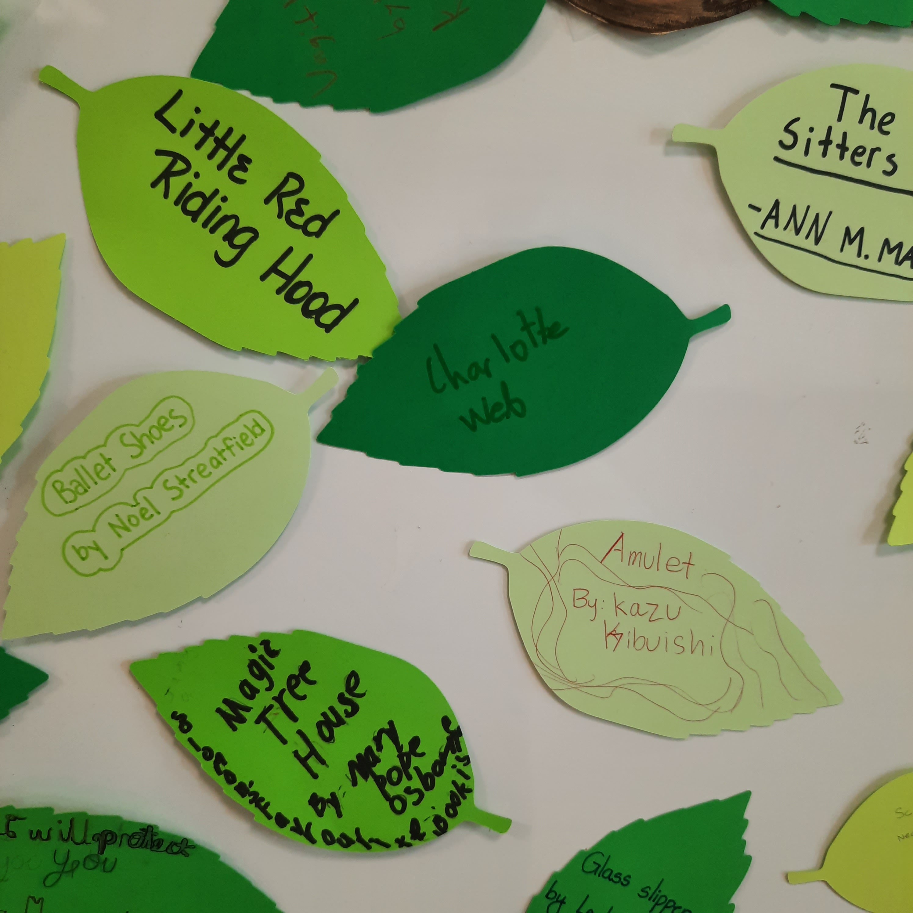
Students were given green leaf templates on which they wrote their favourite book (title and author). These were then taped onto the tree. It got bushier as the week progressed.
It was interesting to read everyone's favourite book.


Wednesday, September 4, 2024

Poured Polar Aurora


For any art teachers that have attended a big art conference, there's often times workshops you can sign up for. This project was one of those. I will say, though, that every art workshop I've attended at a conference, I've never actually taught the lesson to my students!  Crazy, right. I have no idea why. Well, sometimes there's too many steps and I'm nervous to do it with a big class, or too many expensive materials, etc. In this case: pour painting. Has anyone done this with an actual class? It just seems like SO much paint is wasted, and we're always very conscious of our budgets, so it's hard!
I've done it with my high schoolers one on one, when they need a particular effect for an art project. But never a whole class at once.

Anyway, I figured I'd share this lesson in hopes that it helps one of you out there!
It was presented at the NAEA annual conference (National Art Education Association) in Seattle a few years back. It's, I believe, the biggest art education conference in the US. Many teachers LOVE this conference. Unpopular opinion, but I was not a fan of this conference and will, most likely, never attend again. Why? Simply because it was too big. Trying to sign up for workshops was near impossible. Many of them were first come first serve, so there was a mad rush between sessions to try and secure a spot. So I didn't get into many of the workshops I was interested in. I maybe had too high of expectations for this conference and was honestly let down. 

So this particular workshop was offered by Blick Art Materials, a very big US art supply company. They have a great website with free lesson plans  Find the PDF lesson plan for this project HERE.
There's also a very helpful Youtube tutorial. 
I will say I really enjoyed this workshop!

Description:
Pour tempera paint in layers from a cup, then watch gravity create amazing, marblized patterns.
Add a landscape sihouette and the pour becomes a blazing polar aurora in the night sky. Include glow-in-the-dark glitter glue and the auroras will actually glow when the lights are out.


Starting with black cardstock, I cut out a landscape silhouette using an X-acto blade or scissors.


Set this aside for now.


Then, using the same size canvas board (I think this was 5 x 7"),place it in a shallow tray or on paper to protect the table, 


Pour about three or four "aurora" colours of tempera paint into a small cup. You can also add some glow in the dark glue. I was shocked that this paint wasn't thinned down with water or pouring medium. I honestly thought it wouldn't work, that it would be too thick to flow.


Flip onto canvas board and wait 30 seconds for all the paint to flow down. 
Then tilt it in all different directions, getting the paint to flow and cover the whole board. It gets thicker and slower as it starts drying, but don't give up. I think I had to coax some paint onto the empty spots. 


The workshop had some clamshell plastic containers for us to take our art home as obviously it takes overnight to dry. 


Lasts step, place your black paper cut-out on top. Let dry flat overnight. 


They had another example on display using some different supplies.


All packaged up and ready to go. Yes, I had to carry this with me all freaking day!!


Pretty!


Related Posts Plugin for WordPress, Blogger...