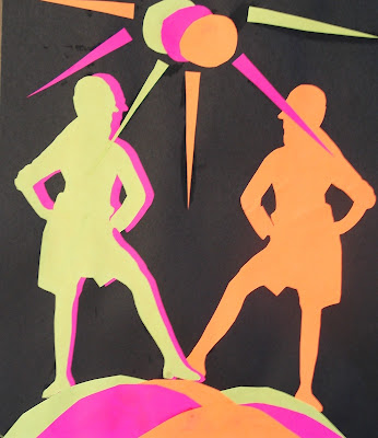
This is a great lesson for teaching about the principles of rhythm and movement in art. I found the lesson on the Mrs. Art Teacher blog where she gives a detailed explanation of the project.
Movement is definitely an area I rarely teach in my classes, so I was really happy to find this project as it seemed really fun for the students and so colourful as well. I taught this to a Grade 8 class and some fast finishers managed to finish it during one 90 minute class period, but I would recommend double that time to ensure good craftsmanship.
I started off by showing some examples of the use of movement in Art. Artworks from the Futurism movement seem to work really well, as they show how to give the illusion of movement and speed through repetition of shapes. Discuss with students how the illusion of movement is created in these works (repetition, overlapping, diagonal lines, etc.)
Rhythm is a principle of design that suggests movement or action. Rhythm is usually achieved through repetition of lines, shapes, colors, and more. It creates a visual tempo in artworks and provides a path for the viewer's eye to follow.
 |
| "Nude Descending a Staircase, No. 2", Marcel Duchamp, 1912 Source |
 |
| "Dynamism of a Dog on a Leash", Giacomo Balla, 1912 Source |
 |
| "Speed of a Motorcycle", Giacomo Balla, 1913 Source |
So start off with a sheet of black paper for the background and then choose three colours of bright coloured paper. I bought a pack (500 sheets) of multicoloured coloured printer paper from Staples- both brights and neon colours. I've also tried this with construction paper but I found the colours just too dull.
Students need to flip through magazines looking for a full page figure in motion- someone walking or jumping or doing sports. I only had fashion magazines, but Mrs. Art Teacher recommends fitness or sporty mags like skateboarding/snowboarding, etc.
Here's an example of a suitable figure:
Do a 'bubble cut' around the figure and then paper-clip it to a stack of your chosen three colours.
Then carefully cut it out. You'll need to move and reposition your paper-clips as you go. I encouraged the kids to really try and cut out the small details (hands, fingers, etc) but it might be too difficult for some. Any interior shapes need to be cut out using an x-acto knife. Save the coloured scraps of paper left from the cutting as students can swap with each other for the background shapes.
Done.
Then you'll have three figures in different colours.
Now design the background. Choose three different coloured sheets of paper and cut out three shapes each of a variety of angular shapes (squares, triangles, rectangles, diamonds, etc.)
The angular shapes contrast against the curves of the figure.
Using a glue stick, glue these onto the black paper, trying to overlap the shapes in a balanced way.
Then glue your figures on top, making sure to overlap and try to use a diagonal line of movement.
My students had fun creating their compositions!
Ta da!


8 comments:
Hi Miss
These look like a lot of fun. I bet you had a very high success rate! Thanks for posting the fine art references.
Wouldn't it be interesting if students brought in photocopies of themselves doing sports?
Rina
glad this worked as well for your students as it did for mine!
It’s fantastic! The result is between the Futurists and Pop Art! Great idea, thanks!!
What a great project to teach movement. These turned out great.
I love the brightness of colors.
This is a really nice lesson. I'd love to give it a try with my 7th and 8th grade students.
Rina- excellent idea! I'll definitely try that next time- a great way to personalize the project.
Mrs. Art Teacher- kudos to you for the great lesson idea!
Miriam- you're totally right- Pop Art and Futurism- you perfectly described it!
Chesterbrook and Janis- thanks so much!
Really nice project! It works really well with bright colors! It enhance the movement has well!
Genial. Me encantó la idea para la figura humana en movimiento.
Post a Comment