Sunday, March 29, 2015

Clown Portraits


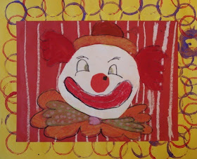
My Grade 2 students recently finished their clown portraits which is part of their Portraiture unit. We've been creating portraits in different medium, using colour to express different moods. 
In this one, obviously we're trying to create happy moods using bright colours. However, if you're like me and find clowns incredibly creepy, then these are not happy! lol

I found the original lesson HERE on the fantastic Kids Artist blog. 

Students first chose a coloured piece of 9x12" construction paper. Then, they drew and cut an oval or a circle onto plain white paper. (This is when you hear all the students say "An oval is soooo haaaard to draw!!") hahaha!
 They cut this out, glued it onto their construction paper, and, using a black marker, 
drew the face and all the details.
They coloured in the clown using either oil pastels or construction paper crayons. 

(NOTE: I keep my oil pastels and chalk pastels in THESE amazing bowls from the children's section at IKEA. They're the perfect size (wide and low and non-tippy). 
Two students share a bowl. They're only $2 for 6 bowls!!

Some students cut out a big red nose from paper. 
On a separate sheet of 12x18" construction paper, students learned about mono-printing. They used a toilet paper tube and dipped it into tempera paint, and stamped it around the border.


Once the borders are dry, glue the finished clown portraits onto it using white glue. 


This clown below is all kinds of amazing!!!!!


Sunday, March 22, 2015

Giraffe's CAN Dance!


Giraffe's Can't Dance has to be one of the most popular art lessons out there for Art teachers. And for good reason- the project teaches so many skills and they always come out so fun and whimsical!

I started by reading the book, "Giraffes Can't Dance" (by Giles Andreae, illustrated by Guy Parker-Rees) to my class. It's a charming story about how being different is okay and how you can still be good at something even though you have to go about it a little "differently." 

The project is done in two parts: the painted background: exploring value changes/gradations, tints, and landscape techniques. Then the giraffe part, which is drawn on a separate sheet of paper and cut out.

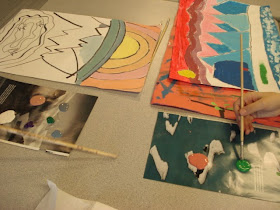
So I demonstrated how to create a value change in the moonlit sky- this was fairly tricky for some kids but after some practice they got the hang of it. We used tempera paint.Towards the bottom of the page they added some distant hills (blue + white = tint)  and then the grass. For the grass, the students mixed their own shade of green using the blue and yellow and white. 
You can use this lesson to reinforce or teach background, middle ground and foreground.


On regular white paper, students drew their dancing giraffe. I gave them a handout with giraffe pictures so they could have something to reference from. We discussed how to get a sense of movement in the pose. The coloured these using coloured pencils, then outlined in thin black marker. Finally, they were cut out (I had to cut out some of the inside cuts with an x-acto knife) and glued onto the background paper. Students then chose to add movement marks, some added white stars, and some wanted to add some glitter glaze for some extra 'pizazz'. 


This project, by far, garners me the most compliments when I hang these up on the bulletin board. Staff, students and parents all love them! It's a guaranteed crowd pleaser!


Thursday, March 12, 2015

Ted Harrison style landscapes


My Grade 4 class recently finished these acrylic landscape paintings inspired by one of Canada's most well-known artists, Ted Harrison. The timing of this project was so strange as Mr. Harrison passed away the day after I introduced this lesson to my students (he was 88 years old).

His work is great for upper elementary students as it's a perfect introduction to stylized landscape art. His art is colourful and accessible. Ted Harrison came originally from England and moved to the Yukon (a Canadian territory) where he taught art. He was inspired by the northern landscapes and life in the Yukon.


My students looked at a slideshow of his work as well as a couple of interviews of him on Youtube.
They designed their own stylized landscape, making sure to include a background, middle ground and foreground. They could also include buildings, animals and/or people.


We used acrylic paint- I love the small bottles from the dollar store. They're much easier to distribute paint from as opposed to large class size bottles. 


Students were encouraged to create value changes or gradations and tints: adding white gradually to one colour.


Once dry, everything was outlined with a jumbo Sharpie.