Saturday, March 24, 2012

Keith Haring-Style Social Issue Poster

This poster is supposed to represent 'alcoholism'.

This is a poster project based on the artwork of American Pop Artist Keith Haring. Haring tends to be very popular with Art teachers as his work is very colourful and accessible to students of all abilities. 

For this project, Grade 9 students had to think about a social issue they felt was important to them. Then they had to come up with a composition, in the style of Keith Haring, to best illustrate the message behind their chosen issue. Haring's bold lines and active figures work well in a poster format; indeed, his works have been used in many posters and advertising campaigns.

Image Source

Haring's famous trademark 'radiant baby'   Image Source

So I started off by showing a slideshow of Haring's work and having the students describe his style. Then we brainstormed and discussed various social issues that might be appropriate.
Then, for practice, I printed off colouring sheets from his website http://www.haringkids.com/master_act_stories.htm  for the students to practice painting on. They used tempera paint which is perfect for this project as it dries nice and flat and opaque 
(but you generally need two coats of paint).

After their practice, they figured out their designs in their sketchbooks, then drew them on large heavy white paper and painted them. A bold black outline finishes them off nicely. Popular choices for the posters included environmentalism, bullying, and drug/alcohol abuse. On the back of each poster, students had to write a bit about what their social issue was and why they chose it.

Practice painting sheets.


Saturday, March 17, 2012

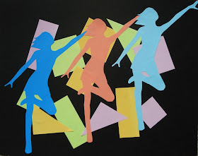
Rhythm & Movement Figures


This is a great lesson for teaching about the principles of rhythm and movement in art. I found the lesson on the Mrs. Art Teacher blog where she gives a detailed explanation of the project. 

Movement is definitely an area I rarely teach in my classes, so I was really happy to find this project as it seemed really fun for the students and so colourful as well. I taught this to a Grade 8 class and some fast finishers managed to finish it during one 90 minute class period, but I would recommend double that time to ensure good craftsmanship.

I started off by showing some examples of the use of movement in Art. Artworks from the Futurism movement seem to work really well, as they show how to give the illusion of movement and speed through repetition of shapes. Discuss with students how the illusion of movement is created in these works (repetition, overlapping, diagonal lines, etc.)

Rhythm is a principle of design that suggests movement or action. Rhythm is usually achieved through repetition of lines, shapes, colors, and more. It creates a visual tempo in artworks and provides a path for the viewer's eye to follow.

"Nude Descending a Staircase, No. 2", Marcel Duchamp, 1912
Source

"Dynamism of a Dog on a Leash", Giacomo Balla, 1912
Source

"Speed of a Motorcycle", Giacomo Balla, 1913
Source

So start off with a sheet of black paper for the background and then choose three colours of bright coloured paper. I bought a pack (500 sheets) of multicoloured coloured printer paper from Staples- both brights and neon colours.  I've also tried this with construction paper but I found the colours just too dull.


Students need to flip through magazines looking for a full page figure in motion- someone walking or jumping or doing sports. I only had fashion magazines, but Mrs. Art Teacher recommends fitness or sporty mags like skateboarding/snowboarding, etc.


Here's an example of a suitable figure:


Do a 'bubble cut' around the figure and then paper-clip it to a stack of your chosen three colours.


Then carefully cut it out. You'll need to move and reposition your paper-clips as you go. I encouraged the kids to really try and cut out the small details (hands, fingers, etc) but it might be too difficult for some. Any interior shapes need to be cut out using an x-acto knife. Save the coloured scraps of paper left from the cutting as students can swap with each other for the background shapes.


Done.


Then you'll have three figures in different colours.


Now design the background. Choose three different coloured sheets of paper and cut out three shapes each of a variety of angular shapes (squares, triangles, rectangles, diamonds, etc.) 
The angular shapes contrast against the curves of the figure. 
Using a glue stick, glue these onto the black paper, trying to overlap the shapes in a balanced way. 


Then glue your figures on top, making sure to overlap and try to use a diagonal line of movement.


My students had fun creating their compositions!


Ta da!


Monday, March 5, 2012

Habitat & Climate Dioramas


This was a cross-curricular project I did a few years ago with an amazing Grade 3/4  teacher. Her students were studying different climates and habitats and together we devised this project. The students worked in pairs (strategically chosen by their teacher) and chose a climate to research, study and eventually, in my class, build. I believe the choices were desert, rainforest, Arctic and grasslands. They drew detailed sketches out in their sketchbook which showed the major landmasses/topographical features they would build, the colours they would use and the different animals that would inhabit that particular climate.

So I had, by this time, collected a bunch of boxes which I had cut down to use as the base for the models. You also need loads of newspaper and masking tape. I have to say, cutting cardboard is one of my  least favourite activities. 

ANYWAY, students drew their plan onto the cardboard in pencil and then black marker in order to see it.


The, using newspaper and masking tape, they scrunched up the newspaper and taped it down in bunches to start creating the land masses. The students worked magnificently in their little groups.


This was the beginning of a huge mountain...


Once all the newspaper is stuck down, students covered everything in strips of plaster gauze. This is where things get really messy but the KIDS LOVE IT! I demonstrated to the kids how to carefully smooth out each strip with their fingers and mould it around the features.


Painting time! I showed the kids how to mix colours and layer colours in order to get a realistic effect.


The huge mountain turned out so well.


While the models were drying, students used coloured plasticine to make all their little animals.
I also had a wide assortment of materials for their use: twigs, moss, sticks, beads, etc. They also brought in things from home and collected stuff from outdoors (sand, pebbles, etc.) they thought might be useful.
Then all of these items were hot glued onto their diorama.


Unfortunately I didn't get any shots of the finished dioramas but here are some close-ups of some of the creatures created. They're pretty cute. The finished models were put on display for the school community to see. 


dog sled in the Arctic


I believe this was a gorilla...


wolves!

penguin


a spiky desert creature

a mountain climber in the Arctic

monkey in the rainforest